Bold Color Combos
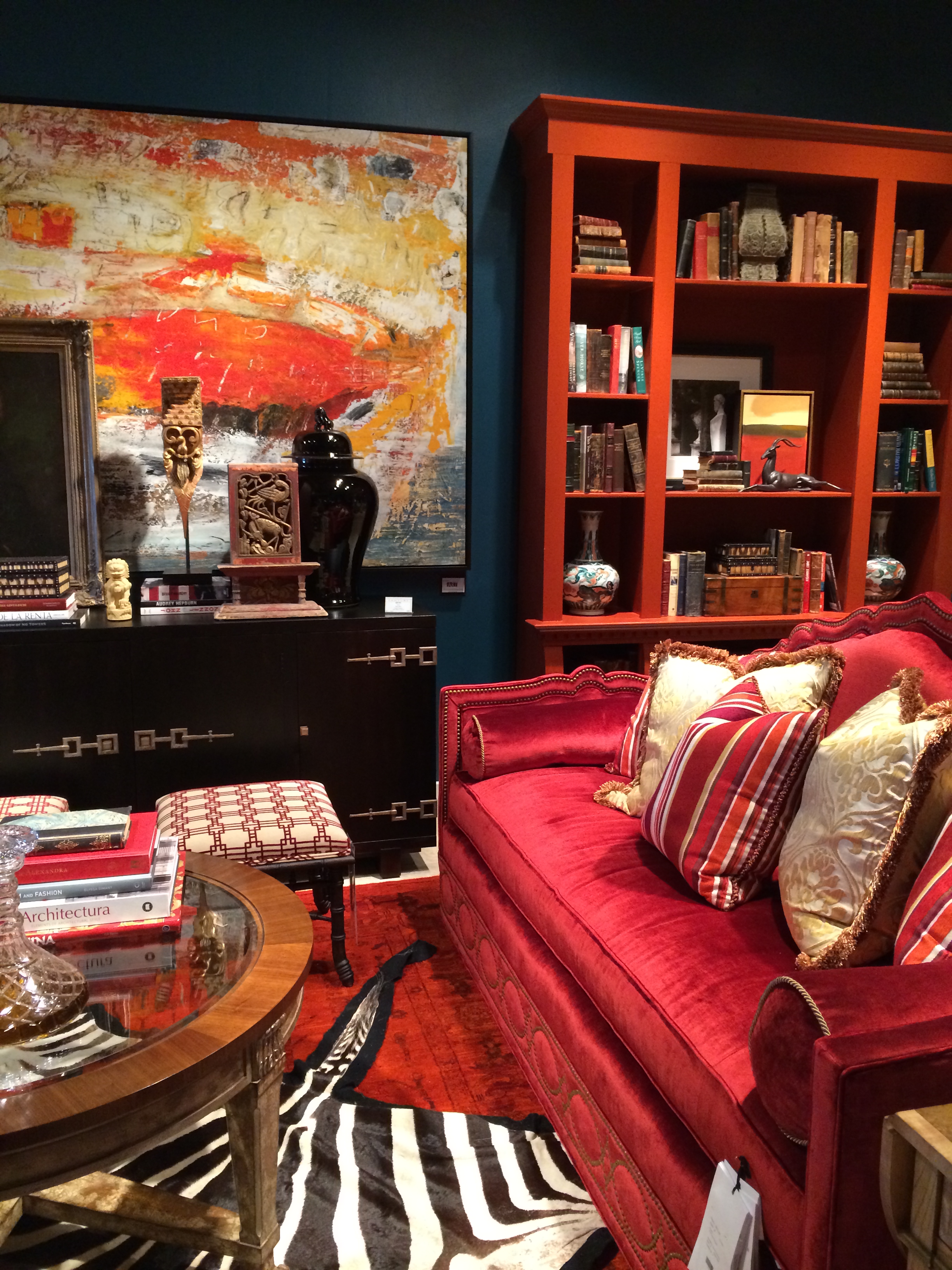
I love, love, great combos of color and was delighted to snap this featured photo of this dynamic room when I ran across it at High Point Market in the Century Furniture showroom. It is no surprise that this is a very well thought out space…because Century has produce quality in craftsmanship and design for many, many years.
As a designer, people constantly ask me what the best color combinations are. The million dollar answer is really a matter of what you like. Some of us like soft tone-on-tone pairings and others like bold strong colors.


This was a fun project from a few years back with a young couple who wanted color and personality to fill their home. They wanted to use the colorful funky sign, (which is somewhat their personality)…so we made it the focus of the room. Now this room makes everyone smile!

This photo from Market...this deep blue room with that pop of orange which partners with blue so well, all balanced with white. I think the yellow trim on the pillow serves as a “splash” of lemon, keeping it all fresh. This makes me think of bright sunshine in a deep blue sea or vibrant energy on a cool, summer day. What do you think?

More Sunshine! What a wonderful way to greet guests entering your home with sunny yellow. These Inner Loop clients were not shy in embracing color. Each room had its own hue which served as the perfect backdrop for hand selected original artwork. Take a tour of this project with just a click
I hope this photo gallery has given you courage to GO FOR IT when it comes to strong color combos. If deep rich colors seems to overwhelm you – take heart and look for my post on soothing, soft tone colors.
Enjoy!
Janus
Comments are closed.